
Not a subscriber? Click here to learn
more.
|
| Home | About Us | Resources | Archive | Free Reports | Market Window |
How the World's Best Investors See the MarketBy
Thursday, September 17, 2009
The world's best investors don't see the market the way you do.
And I mean that literally... They look at the market through different lenses. Most investors know how to value equities using various valuation ratios – like the price-to-earnings ratio, the price-to-book ratio, or dividend yields. These valuation studies are important when you're buying individual stocks. And they can give you some idea of whether or not the market as a whole is attractive. But... there are much better ways to see valuation in the markets. For example, here's a chart of the S&P 500 going back to 1975. This is the way you probably look at the market today. And when you look at the market this way, it appears pretty expensive. Stocks have been mostly going up for a long time. The recent big selloffs didn't bring the S&P 500 index back down all that much... or so it seems when you look at a plain chart.  But there's a much better and more accurate way to view the markets. The next chart is the S&P 500 again, from the same time period (starting in 1975). As you can see, this chart looks nothing like the first one. In this chart, you can plainly see the big top formed in stocks in the early 2000s. And you can see the huge mania of the 1990s – where the chart goes nearly straight up. But in this chart, the second top in stocks we saw in 2007 doesn't exist. It's like the bull market of 2002-07 never happened. 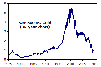 This chart is the S&P 500, but measured in gold, rather than U.S. dollars. What it shows is the value of stocks compared to gold. Gold is a much better standard of value than the U.S. dollar because it can't be printed or manipulated as easily as the U.S. dollar. What this second chart makes clear is how cheap stocks have really become – something you can't see on the regular S&P 500 chart because of the effects of inflation. At the bottom of stock prices in the late 1970s, just one ounce of gold (then at $800) would have bought an entire unit of the Dow Jones Industrial Average. Stocks and gold were trading on a one-to-one basis, based on this measure. At the peak of stock prices in 2000, a unit of the Dow was worth $14,000. And an ounce of gold was only worth $260. To buy the Dow would have cost more than 50 ounces of gold. Obviously, stocks were extremely expensive – 50 times more expensive than they were at the bottom in 1980. Today, gold is trading around $1,000 an ounce. And the Dow, at its recent low, was near 6,000. It would have taken roughly six ounces of gold to buy the Dow. Looking at stocks through the lens of gold gives you a much better idea of where we are in terms of sentiment and valuation. Using this gold ratio will help you make much better asset allocation decisions. You want to buy stocks when the ratio of the Dow to the price of gold is low – less than 10. And you want to buy gold when the ratio is high. Using a chart just like this, my partner Bill Bonner began to tell people to buy gold and sell stocks in 2000. Using the same chart, I told Doug Casey's Gold Summit audience in March of this year to buy stocks instead of gold. While we may not yet be at the exact bottom of the gold-to-stock ratio, we're close. I'm not telling you to sell your gold. I'm not selling mine. But looking at the chart of stocks vs. gold, you can clearly see it's time to begin to fade gold and buy stocks. Good investing, Porter P.S. This secret – knowing how to intelligently value assets – is one of the seven secrets of the world's best investors. I dedicated my most recent issue to these seven secrets... many of which I'm sure you've never heard of. I think it's the most important thing I've written all year. You can learn how to access this issue here.
Further Reading:
How to Protect Yourself from the End of America Market NotesABOUT THAT EUROPEAN VACATION... CANCEL IT
A quick note for all the vacation planners out there: Don't ski in Switzerland this year, stick to Colorado. Don't sip wine in France, stick to Napa Valley.
Today's chart gives you the reason. It's the abysmal performance of the U.S. dollar in 2009. You can view currencies like the "stock" of a country. When times are good and its finances are in order, a country's currency tends to rise. When times are bad and its finances are a debt-soaked mess, a country's currency tends to fall. Measured against a basket of other currencies, the dollar is down 10% since the spring. This is an enormous drop for a major currency. It's a drop that has eroded the purchasing power of your savings account, the cash in your wallet, and your "vacationing power" as well. It's the sort of fall that leads American tourists in Europe to shake their heads and say, "Good lord, things are expensive here!" Our advice right now: Keep the vacation in the States. 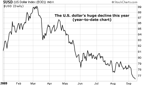
|
In The Daily Crux
Recent Articles
|


