
Not a subscriber? Click here to learn
more.
|
| Home | About Us | Resources | Archive | Free Reports | Market Window |
Is the CPI Telling Us the Full Story on Inflation?By
Thursday, April 2, 2015
You can't fully trust economic statistics...
As I explained in yesterday's essay, measuring the economy is difficult. Very difficult. And in a sense, there are no "real" numbers.
But the official measures of inflation, gross domestic product (GDP), or employment aren't the result of some conspiracy agenda. And a close look at GDP data confirms the economy is still slowly recovering from the financial crisis.
Today, I'm going to take a deeper look into the "official" story on inflation. And more specifically, I'm going to see if one of the most controversial government statistics – the Consumer Price Index (CPI) – is telling us the full story.
Let's get started...
Inflation is supposed to reflect the overall change in consumer prices. But it depends on your perspective whether you think the number is "real."
The number most people refer to when discussing inflation is the CPI, calculated by the U.S. Bureau of Labor Statistics. The CPI is designed to reflect the price of a basket of goods and services, including transportation and housing.
Some people claim that the CPI has been systematically altered to make it seem tamer than it is.
Well, the Billion Prices Project – an economic research initiative from the Massachusetts Institute of Technology (MIT) – took an entirely new approach and tried to get a "better" picture of the price of nearly everything. Its results matched the CPI almost perfectly. (Take a look here.)
No one is monkeying with these numbers...
The real challenge when talking about inflation is trying to figure out how much more expensive it is for people to live. That's a hard question to answer.
For instance, a home computer in the mid-1990s cost $3,000. Today, you can get one that is 50 times faster for one-sixth the price. Is that deflation? How do you account for the progress in technology?
Or let's say that beef prices rise and shoppers switch to chicken. Is that a rise in the cost of living? (The Bureau of Labor Statistics tries to account for these things with one of my favorite economic numbers... what's known as a "hedonistic adjustment.")
But no matter how you slice it, inflation today remains extraordinarily low.
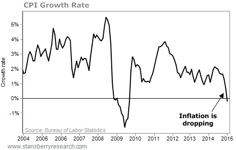
Don't believe me? Here's a chart bank of different inflation-related numbers. For each, we'll provide a long-term view so that you can see what used to happen when inflation was at normal levels...
We've already discussed the CPI... Here you can see it's at its lowest point since the 2008-2009 financial crisis. You can see the index declined 0.7% in January.
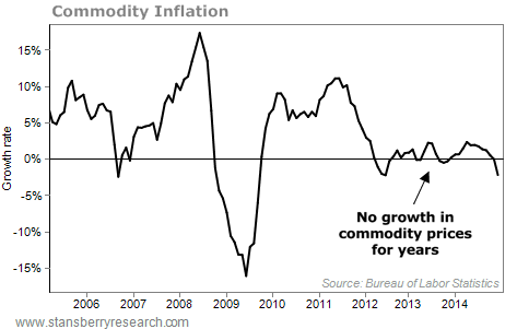
 Now, take a look at what commodities prices are doing... Here's a chart of the All Commodities section of the Bureau of Labor Statistics' Producer Price Index. As you can see, commodity prices also fell – the growth rate dropped below zero – in January...
 You can see the same trend in the Bureau of Labor Statistics' index of the prices of goods (other than fuel) coming into the U.S. Again, the prices fell in January...  These inflation stats show that things are not heating up. Overall, no inflation means no intervention from the Fed. Which means cheap money and continued rising asset prices. That's why I'm still confident this bull market isn't over yet... and why I'm recommending that my readers continue to buy quality blue-chip, income-producing stocks.
Tomorrow, we'll look at another hotly contested government statistic... unemployment. We'll see if the official employment numbers are to be trusted... and check in with my "Cabbie Index" for a real-world view on the job market.
Here's to our health, wealth, and a great retirement,
Dr. David Eifrig
Further Reading:
You can find more of Doc's data-driven market insights right here:
Many investors are scared right now. But should they be?
The economy is growing briskly... but is it booming – in the sense that booms lead to busts?
If you're interested in earning dividends in 2015, it's worth hearing what this indicator has to say...
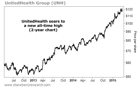
Market NotesAN UNLIKELY WINNER FROM OBAMACARE Today's chart tells us Obamacare is very, very good... as long as you're in the right business.
Over the past few years, we've told you many times how Obamacare and the aging of Baby Boomers would create an industry-wide boom in the health care sector. But since Obamacare was originally supposed to provide a "free" alternative to health insurers, many investors believed health-insurance companies would suffer from increased competition. That hasn't been the case... Health insurers are booming.
For proof, we look to UnitedHealth Group (UNH). Serving approximately 70 million Americans, UnitedHealth Group is the nation's largest health insurer. Therefore, it's a good gauge of what's happening in the health insurance sector.
As you can see below, business is booming. Shares of UNH are up 100% in the past two years... and on Monday, shares struck a new all-time high. Obamacare isn't hurting health insurers... it's actually boosting business.
 |

Recent Articles
|


