
Not a subscriber? Click here to learn
more.
|
| Home | About Us | Resources | Archive | Free Reports | Market Window |
The Most Important Chart in the World Right NowBy
Saturday, February 20, 2010
To most people, any talk of the U.S. government debt simply doesn't mean anything.
For instance, I could tell you the annual funding costs of our national debt are approaching $4 trillion per year – that's $1.5 trillion in new annual deficits, plus $2 trillion-$3 trillion a year in short-term obligations coming due that need to be refinanced. Foreigners hold roughly half of this debt. Thus, we have about $2 trillion in foreign debt that must be repaid or refinanced each year. But this obligation is so large that it's meaningless to most people. I could also tell you $2 trillion is 20% of our GDP, but even then, most people won't understand just how much money this is. So think of it this way... If you spent $1 million per day from the time of the founding of Rome – roughly 2,700 years ago – until today, you would have accumulated about $1 trillion in debt. Now, double that amount. And that's the size of our annual foreign borrowing obligation. (Thanks to Eric Margolis for the trillion-dollar metaphor. See his essay "Spending America Into Ruin" here.) But more important than understanding the size of this debt, it's vital that you understand its effects. In this essay, I'll show you the easiest way to track those effects... and the actions you must take to protect yourself from them. The Barclays iShares 20+ Year Treasury ETF (TLT) tracks the value of the U.S. government long-bond market. This is the primary market the Fed was trying to support over the last year. Gold, on the other hand, is the best market-based judge of the soundness of the U.S. dollar and our creditors. The SPDR Gold Shares ETF (GLD) is an accurate proxy for the price of gold. Look what happened to U.S. bonds (TLT) and gold (GLD) over the past year. This occurred even as the Fed was massively intervening in the credit markets. 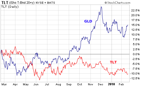 Note the value of the U.S. long-bond market fell by more than 10% despite the government support. And the value of gold increased by more than 10% as investors fled the dollar. It's interesting the relative moves were nearly identical. There's no free lunch. For every penny the government prints or borrows and uses to manipulate long-term interest rates, that same penny is being taken out of the value of the U.S. dollar, as is revealed in the price of gold. You will see lots of debates about what the coming currency crisis means. But if you can simply understand this chart, you will grasp what's happening and how to protect yourself. It's simple: The value of the dollar is collapsing as the un-creditworthiness of the United States becomes evident. That means the price of hard assets – like gold – will keep rising and the value our government's long-term obligations will fall. The safest thing to do right now is split your savings between short-term Treasuries and gold. That's the equivalent of a "cash" position, as the gold will hedge your dollar exposure and the short-term Treasuries will mitigate the volatility of gold. You can do this through ETFs. The Barclay's iShares 1-3 Year Treasury ETF is an easy way to own short-term Treasuries. The symbol is SHY. And GLD is the most liquid gold ETF. I personally hold my gold in bullion coins and recommend you do the same. It's better and safer than the ETF. But for lots of people, the ETF is simply more convenient. However you decide to take a position in gold, do it soon. I expect the divergence you see above – of U.S. debt decreasing in value, while gold increases in value – to get much bigger in the coming years. Good investing, Porter Stansberry P.S. So... what happens when the U.S. dollar enters crisis mode? I don't think anyone knows for certain. But I know a few things are very likely to happen – soaring hard commodity prices, for example. In my latest newsletter, I tell my subscribers how to protect themselves from a full-blown dollar crisis. It's coming. If you'd like to receive my report, which was released yesterday, click here. Market NotesTHE BIGGEST NUMBER IN THE WORLD
Our chart of the week is an update on one of the most important "must watch" numbers in the world... the yield on the 10-Year U.S. Treasury note.
The 10-year yield is the most commonly tracked gauge of how much Uncle Sam must pay creditors to borrow money. A rising yield indicates creditors are demanding higher rates to compensate them for the risks of loaning money to the sovereign equivalent of a 15-year-old with daddy's credit card. A falling yield indicates a sluggish economy and no worries about inflation or the creditworthiness of the U.S. Some analysts, like our colleague Porter Stansberry, believe our creditors will demand much higher rates of interest soon... rather than the current 3.82% yield. As you can see from this week's chart, the 10-year yield just jumped toward a new 12-month high... and is close to an upside breakout over 4%. If this breakout happens, it's the market saying, "Yes, Porter is right. Creditors are requiring more yield... and I'm sending rates higher." – Brian Hunt |
In The Daily Crux
Recent Articles
|


