
Not a subscriber? Click here to learn
more.
|
| Home | About Us | Resources | Archive | Free Reports | Market Window |
|
Editor's note: This week, we're interrupting our regular schedule to share an important essay from our colleague Greg Diamond. Greg is a former hedge-fund trader and our in-house expert when it comes to technical analysis. Today, he'll explain some of the tools that help him find attractive trading setups...
How to Spot the Best Trading Opportunities in the MarketBy
Saturday, April 21, 2018
Today, I'm going to share several of my favorite technical indicators and patterns. Becoming familiar with them will help you to spot the best trading opportunities in the market.
Hundreds of technical terms and different uses exist in the markets. But the indicators I'm discussing today are what I have found to be the most useful...
As I said yesterday, this is most likely a brand-new way to look at the market for most people... So it's going to take some time to get used to.
But once you understand the basics, I promise you'll begin to see the market like you've never seen it before. Let's get started...
I look for price divergence across major indexes. When one index makes a new cycle low (or high) while another doesn't, this creates divergence.
That's usually a sign of a reversal on the horizon. It can be tricky to spot this pattern, but it's valuable to understand...
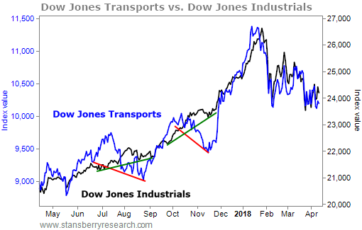 Notice the divergence between the Dow Jones Transportation Average and the Dow Jones Industrial Average... You can see that the Transports' lows (the red trend lines) are much lower than the Dow's lows (the green trend lines). You can also see that these lows in the Dow trended up ("higher lows") while the lows in the Transports trended down ("lower lows").
This is a divergence between the two indexes. Notice how the divergence in both instances above resulted in a big move as both indexes shot higher.
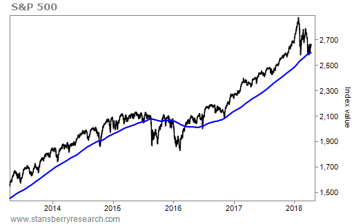
Moving averages are constructed by taking an average of a time series over a given period. The 50-, 100-, and 200-day moving averages ("DMA") are widely followed averages to determine support and resistance points.
Many trading systems are geared around these averages in some capacity.
Right now, the 200-DMA on the S&P 500 Index is at a big support level (meaning the S&P 500 hasn't dipped far below it in a while). You can clearly see it in the chart below...
 The market tends to trade in equal legs or movements, especially in corrective patterns.
Specifically, in a bull market, a correction usually has three legs, where the length of the first leg is equal to the third leg. Here is a perfect example of price symmetry from the S&P 500 last year...
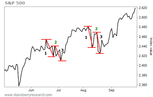 Notice the first leg in each pattern is about the same size as the third leg. Also, notice how after the third leg was complete, the market rallied. Spotting price symmetry is important.
It uses a scale from 0-100. A reading of 30 tends to be at or near oversold levels and a reading of 70 tends to be at or approaching overbought levels.
You can see the RSI and how it hit the 30 level at the bottom of this chart in the S&P 500. After that, prices rallied...
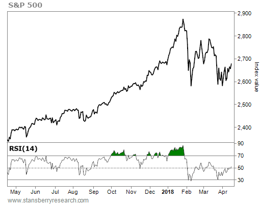 This metric looks for differences between the price of an asset and its RSI level. This can signal buyers losing momentum on the upside, or sellers losing momentum on the downside...
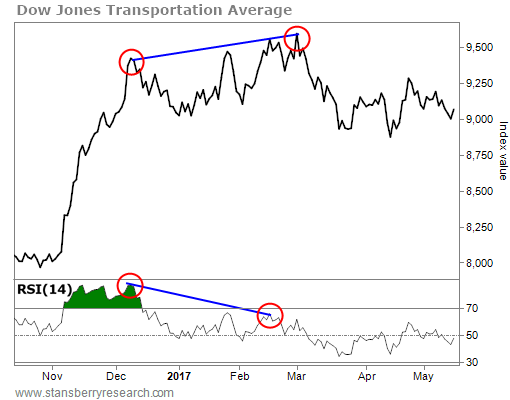 Look at the circled points on both the chart and RSI indicator in the bottom panel. Do you see how the trend in price is rising while the same points on the RSI are declining? This is divergence – and it was a warning sign of buyers losing momentum. Notice how prices fell for another two months after this signal triggered.
I'm constantly looking for the biggest trends in play as they relate to other asset classes or sectors of the stock market.
As a trader, I want to own what goes up and sell short what goes down.
Within the stock market, certain sectors behave differently given the current environment. Sector ratio analysis cuts through the weeds of individual companies and graphically shows what sectors are outperforming the overall market. Take this example of the Technology Select Sector SPDR Fund (XLK) versus the iShares U.S. Real Estate Fund (IYR)...
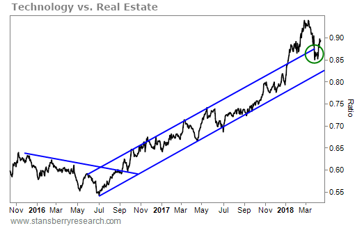 This chart reveals that buying XLK and selling short IYR would be a great trade. Another example of ratio analysis is used on different asset classes...
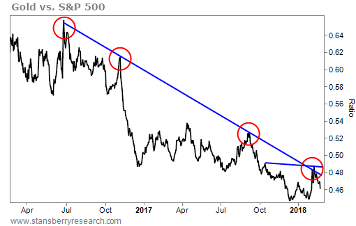 This chart shows what would have happened if you bought gold and sold stocks. In other words, you would have lost a fortune. This is ratio analysis at its best. It signals the best trends relative to other asset classes to allocate to your portfolio – and more important, the assets or sectors to avoid.
This type of analysis is also fantastic at signaling a change in correlations between asset classes – a critical component to understanding major shifts in economic trends.
The history of the market repeats, usually in cycles. Finding those cycles can be difficult, but using time as a roadmap for what to expect is critical for successful investing.
I've spent more than a decade studying the history of the market and extrapolating the data to better understand when to expect a move. The key is to understand the larger cycle in play and then use the shorter cycles to identify turning points within each month.
It is not an exact science – nothing in the market is. But combining the technical indicators above with time-cycle analysis can be a very powerful combination...
Famed investor Stanley Druckenmiller once said diversification is a dirty word. "Put all your eggs in one basket and watch the basket very carefully," he said.
That quote profoundly changed my thinking on investing and portfolio management.
I attended an exclusive, invitation-only conference at Goldman Sachs, where Druckenmiller and President George W. Bush were the main speakers.
I'll save the details of the speech for a more appropriate time, but I want to emphasize how important this idea is... that being too diversified and having too many baskets with too many eggs in them can wreak havoc on performance.
In my experience, more positions mean more problems. That's why in my new Ten Stock Trader service, I'll only recommend a maximum of 10 positions at a time. This will allow me to focus all of my energy and attention on a limited number of positions.
It keeps things simple.
What does this mean? It means I have a medium- to longer-term outlook on the future of the major asset classes – stocks, bonds, precious metals, and commodities.
This is where the short-term trading of options and technical setups come into play. Many global macro hedge funds trade their portfolios this way every day.
We'll trade exchange-traded funds (ETFs). I'll recommend these ETF trades to track major stock indexes like the S&P 500 or sector trades like IYR. I'll recommend both long and short positions.
We'll also trade naked call and put options, along with more complex options strategies like "risk reversals," "call spreads," and "put spreads." If you aren't familiar with these strategies, don't panic. The names sound sophisticated, but I'll explain each trade in detail.
Finally, we'll trade individual stocks.
I analyze thousands of charts every single week. I'm looking for a combination of various factors (many of which I've outlined above) to determine the best trading setups.
The instructions for each trade in Ten Stock Trader will be based on a percentage of your portfolio. For example, if I say to buy a 10% position in XYZ stock and you have allocated $100,000 to Ten Stock Trader, then you'd buy $10,000 worth of XYZ stock for that trade.
I will always indicate the percentage allocation on every trade. Make sure you follow these instructions. Never risk your entire portfolio on one trade. Ever. Period.
This is the No. 1 reason why investors go broke.
You see, we recently went live with the "beta testing" of Ten Stock Trader.
We typically only share opportunities like this with our lifetime Stansberry Alliance subscribers, who pay thousands of dollars to access all the products we offer. But for the first time ever, we're giving any interested readers the chance to beta test this product...
Best of all, you can get access today for 85% off the price others may pay in the future.
We're doing this for one simple reason... We want to hear what you think about the product – and we want you to be brutally honest. Find out how to become a beta tester right here.
Good investing,
Greg Diamond
Editor's note: We just launched the beta version of Greg's brand-new Ten Stock Trader service... Each week, he plans to share as many as 10 setups that could help you potentially double your money – or more – every six months. And if you sign up right now, you can get instant access at 85% less than what others could pay in the future. Get started right here.
|
Recent Articles
|


