
Not a subscriber? Click here to learn
more.
|
| Home | About Us | Resources | Archive | Free Reports | Market Window |
|
Editor's note: We know many of our readers are concerned about U.S. oil stocks right now... That's why we're sharing our friend Chris Mayer's recent essay on the subject. Below, he shares his brilliant case for why things can still get worse for the sector...
Horror Show Not Over in Oil StocksBy
Friday, November 6, 2015
I have a scary story to share...
It has to do with U.S. oil stocks...
As bad a run as they've had, it could get worse.
"I want to warn the investors here," Jim Chanos began, "whether you are a bear or a bull, I do not recommend that you become a potential purchaser of certain securities in the oil patch in the U.S."
Chanos, founder of Kynikos, is famous for calling a number of financial disasters, such as former energy company Enron and, more recently, pharmaceutical company Valeant. I've been following Chanos for a long time. His views are always worth considering.
He gave a thoughtful presentation on oil and gas at Grant's Fall 2015 Investment Conference at the Plaza Hotel in New York. I want to share some highlights from that talk below.
To get right to the meat of it, most oil producers don't produce any net cash. I'll show you proof in a minute.
Not producing cash is a big problem when you've taken on a pile of debt. Fueled by cheap interest rates, oil producers gorged on debt to fund ambitious drilling plans. Now they can't pay it back.
Not producing cash is also a big problem when you have to spend all the cash you produce just to keep production flat. If they stop spending, they'll start shrinking.
And the incentives are all screwed up. Most short-term management compensation focuses on production growth. The valuations on the stocks, too, depend on showing production growth. There's no incentive to produce a cash return on what you spend. Not yet.
What happens when you consistently spend way more than you make?
Yes, the end result is that many leading E&Ps are in trouble. ("E&P" is the handy term to describe firms in the business of exploration and production of oil.) I thought this chart below, from Chanos' presentation, was rather eye-opening.
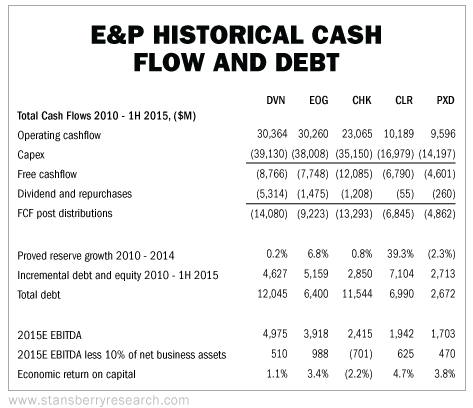 This chart shows five-year summary results for five of the largest E&Ps. Across the top are the tickers for Devon, EOG Resources, Chesapeake, Continental Resources, and Pioneer. There are a lot of numbers here, but let me point to a few of the most important. First, you can see none of these companies produced any free cash flow. Whatever cash their operations produced they put right back in the ground (through capital expenditures, or "capex").
And even though they produced no cash, they all paid dividends. The way they funded this was take on a lot of debt.
Finally, you can see that "economic return on capital" line at the bottom. Those numbers are abysmal. I've banged on a lot about the importance of earning a high return on capital and being able to reinvest and earn those returns again and again.
These oil companies consume huge amounts of cash and produce a poor return on their assets.
The oil industry, for the most part, doesn't think about return on capital. It focuses on making more and more oil.
Over time, this has weakened its financial strength. There are a couple of old-fashioned ratios that help you see this: the current ratio and the quick ratio.
The higher the better. You want both to be more than one at a minimum. Ratios of more than two mean you are usually quite comfortable – you can meet your obligations as they come due, with assets to spare. Ratios of less than one can often signal upcoming financial distress. They mean, as of that moment, you can't meet your obligations as they come due. You need to sell assets, raise cash, or borrow more somehow.
Well, there is a lot bad stuff about to happen to oil producers if these ratios hold true.
I want to share another eye-opening chart from Chanos. This shows you many more E&Ps. It also shows you the current and quick ratios, along with a couple of measures that Chanos flags as areas of concern.
Take a look.
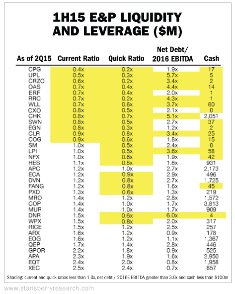 The stocks with highlighted areas are the ones with troubling figures. Print this out and check your portfolio against it. Doing so could save you from enduring more losses down the road. Less dire but still really interesting are the big oil producers: BP, Chevron, Exxon, Royal Dutch Shell, and Total.
They've all spent way more than they've brought in. They've all taken on lots of debt. And they've all – every one of them – seen their returns on capital fall since 2009.
Take a look at this chart, again from Chanos:
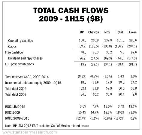 Again, math is math. Investing is ultimately a numbers game. Maybe you can trade these and make some money. But these figures are not a recipe for compounding gains over time. They are a sign of firms that are in trouble. Big Oil is self-liquidating. Cycles in finance take a long time to play out. We had a great boom in the natural resource sector. With the passage of time, it looks more and more like it was a bubble. It has popped, and it's over.
Now begins the process of building a new base for the next bull market. But it will take time. If history is any guide, we'll see more bankruptcies first. Chanos noted that there have been eight oil and gas bankruptcies so far this year, compared with just three in the prior three years combined.
We'll need to see these firms fix their balance sheets. This could be painful for stockholders as these companies tap the market for more funds, selling stock at depressed prices because they have to.
We'll see consolidation as stronger players take out weaker ones at cheap prices.
We'll need to see production come down, too, to firm up the price of oil. U.S. production will probably be up around 6% this year, despite a 59% drop in the rig count. (Again, a lesson in human ingenuity. Don't bet against it.) Though, as Chanos pointed out, it looks like oil production will fall in 2016 by about 4%. It's a start.
I remember when people thought oil and gas and other commodities would protect them against money printing and low interest rates and inflation. What irony it is, then, that the low rates and easy money instead led to the creation of a huge surplus of these commodities. Instead of helping oil prices, they destroyed them.
The scary story is we're not done yet.
I'm with Chanos here. I do not recommend you become a purchaser of certain securities in the U.S. oil patch.
Regards,
Chris Mayer
Further Reading:
Find more of Chris' insights in DailyWealth right here:
"Forget the day-to-day stock market movements and treat predictions – no matter their source – as the true guesses they are."
"The greatest fortunes come from gritting your teeth and holding on..."
"Paying too close attention to the news could hurt your returns – and will certainly keep you from ever earning 100 times on a stock."
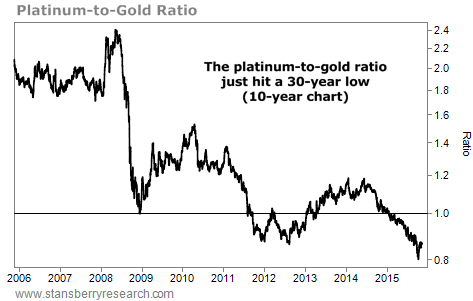
Market NotesTHIS RATIO JUST HIT A 30-YEAR EXTREME Today's chart highlights an important extreme taking place in the commodity sector right now...
We're talking about the extreme in the platinum-to-gold ratio. If you've ever been to a jewelry store, you know a platinum ring typically costs more than a similar-style gold ring. This is almost always the case because platinum is more rare than gold. And since it has more uses in industry, it gets used up, leading to higher prices.
But today, that's not the case... Right now, you can actually buy an ounce of platinum ($955) for less than an ounce of gold ($1,100). This doesn't happen often... as you can see from the ratio chart below. (When the line on the chart is above 1, platinum is more expensive than gold. When it's below 1, gold is more expensive than platinum.)
Compared with gold, platinum is nearly the cheapest it has been in the last 30 years. If you invest in precious metals, this is a trend worth keeping an eye on...
 |

Recent Articles
|


