
Not a subscriber? Click here to learn
more.
|
| Home | About Us | Resources | Archive | Free Reports | Market Window |
The DEATH CROSS Is Here in Stocks... But Should You Care?By
Thursday, February 11, 2016
"Watch out! The Death Cross just happened in the stock market..."
I'm sure you've heard this before on TV or in the news if you follow the markets...
But should you care about the Death Cross? Or is it just another useless indicator with a dramatic name?
We've actually found a way to make the Death Cross indicator incredibly useful to you as an investor – thanks to our True Wealth Systems computers.
Importantly, the Death Cross is in play, right now.
In fact, something much worse than the Death Cross is here, too...
You need to know about both of these and the implications they can have on your portfolio...
Our twist on the Death Cross (sorry, I didn't name this indicator) is more than just "useful" – our twist is actually darn important – when you see how we use it...
Let me show you. Take a look at this chart below...
When this line is green, we're in "Golden Cross" mode... You want to own stocks in this mode. The yellow line is the "Death Cross" mode... You want to avoid stocks here.
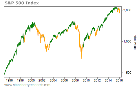 It's simple. Green is good. Yellow is bad. The chart above shows the last 20 years. You can see that we've mostly been in Golden Cross mode. Unfortunately, we're in Death Cross mode right now. The results are similarly good going back over 40 years – to 1972:
We've been in Death Cross mode 30% of the time since 1972. And during those times, stocks have essentially returned nothing. By the way, the math behind the Death Cross is simple. Here's how it works...
The classic stock market "Death Cross" occurs when the 50-day moving average crosses below the 200-day moving average. This is thought of as the start of a downtrend. The Golden Cross is when the opposite happens. (For our calculations, we used the 10-week and 40-week averages, instead of daily data. The result is roughly the same.)
Importantly, there's actually a worse mode than Death Cross mode...
Let's call it "Red Death" mode.
This happens when we're in Death Cross mode AND the stock market is below both the 10-week and the 40-week averages. That's when things are REALLY bad.
It doesn't happen often. But when it does, stay away.
Red Death mode has only been "in play" about 17% of the time since 1972. That means stocks have been in Red Death mode for a cumulative seven-plus years since 1972 – and they've delivered a terrible NEGATIVE 5% compound annualized return in this mode.
In short, when stocks are in Red Death mode, you want to avoid buying them. You want to follow your trailing stops closely by taking advantage of good investment tools. You want to play better defense than offense.
Unfortunately – after steering clear of Red Death mode most of the time since 2012 – we are now back in it today.
One important point here... This indicator only looks in the rear-view mirror.
My opinion is that stocks should actually have a lot of UPSIDE from here. I think that stocks have not yet hit their ultimate peak in the great bull market.
Of course, the market doesn't care about my opinion. The market is going down.
You can't force the market to listen to your opinion. You need to simply play the hand you're dealt. Right now, we're being dealt Red Death mode...
You now know what to do: Play it safe...
Good investing,
Steve
Further Reading:
TradeStops founder Richard Smith recently explained why now is the time to "double down" on your commitment to being a disciplined investor. "Making sure that you don't get hurt too badly when you're wrong is the great secret to ultimately succeeding as an investor," he says. Learn more here.
Steve says to consider buying platinum today. It has all the components of a perfect investment... It's 1) cheap, 2) hated, and 3) in an uptrend. Get the details here.
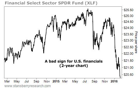
Market NotesA WARNING SIGN FROM AMERICA'S FINANCIAL BACKBONE Today's chart shows why we need to proceed with caution in the market right now...
We're talking about the latest action in the U.S. financial system. The financial sector can tell us a lot about the economy. It rises and falls with America's ability to make and save money, launch new businesses, and repay debts.
We monitor the action in this industry with the Financial Select Sector SPDR Fund (XLF). With large weightings in big banks like Wells Fargo, JPMorgan, Bank of America, Goldman Sachs, and Citigroup, XLF represents the core of the U.S. financial system. In a struggling economy, demand for bank loans falls... and borrowers struggle to pay them back. People stop spending frivolously.
That's what we're seeing today... Shares of XLF have fallen hard in 2016. The fund is already down 14% this year and is trading at its lowest level in more than two years. America's "financial backbone" is telling us to use caution...
 |
Recent Articles
|


